As I delve into the world of photography, it seems everyone must go through the hell of understanding colour and how it is interpreted and represented in the digital and online world. This is my journey.
It all started when I got a few comments about some photos I had sent off to my family. “Too much saturation!” I heard. Hmmm I thought, I’ll have to look into that. I had just started to use Photoshop to make a few tweaks to my images and wasn’t sure what was going on. I didn’t think much of it at the time as I was busy with other things but it sat there in my subconscious. Fast forward two years and it’s now on the front burner for me because I’ve heard my sister talk about having the same issue with her photos and I’ve a renewed interest in photography, I figured it was time for me to get to the bottom of this. It’s been quite the can of worms to be honest because not only am I approaching this issue from a photographer’s perspective, I’m also looking at it from a web developer’s point of view since colour is important in UI design. I’ll touch on that second point in some later post but for now I’m going to focus on the photography aspect.
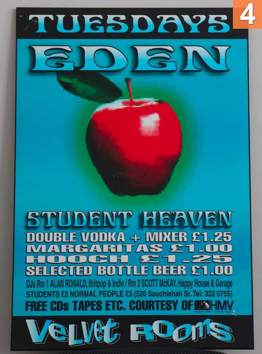
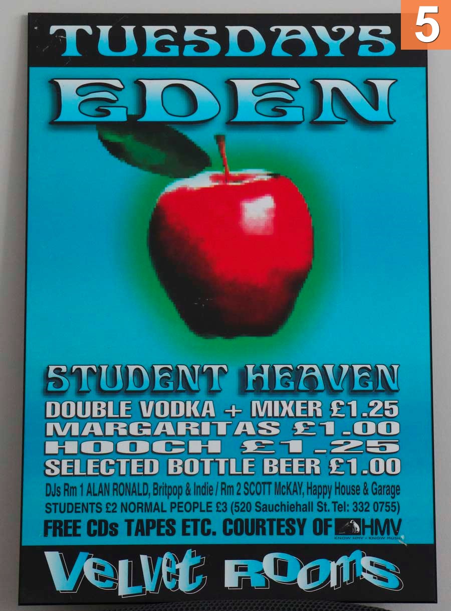
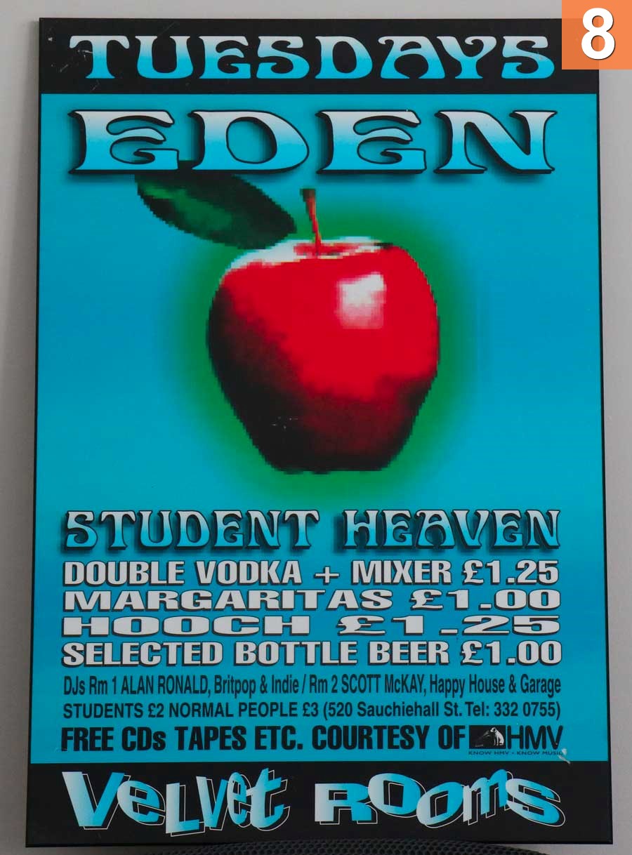
My journey is not yet complete as I’m still in the process of finding the optimal solution but this post is about me laying the ground work by having a a set of reference images. These images have been saved different ways using Photoshop and other applications. I plan to update this post over time as I figure things out.
My goal is to have my photos show consistently the same (not necessarily accurately) across multiple browsers (Internet Explorer, Firefox, Chrome, Opera, Safari) on multiple operating systems (Windows, Android, MacOS X and iOS) and to viewed the same within different applications ( Photoshop, Outlook and FastStone Image Viewer). That’s all I’m asking for. You would be surprised how hard it is to achieve that.
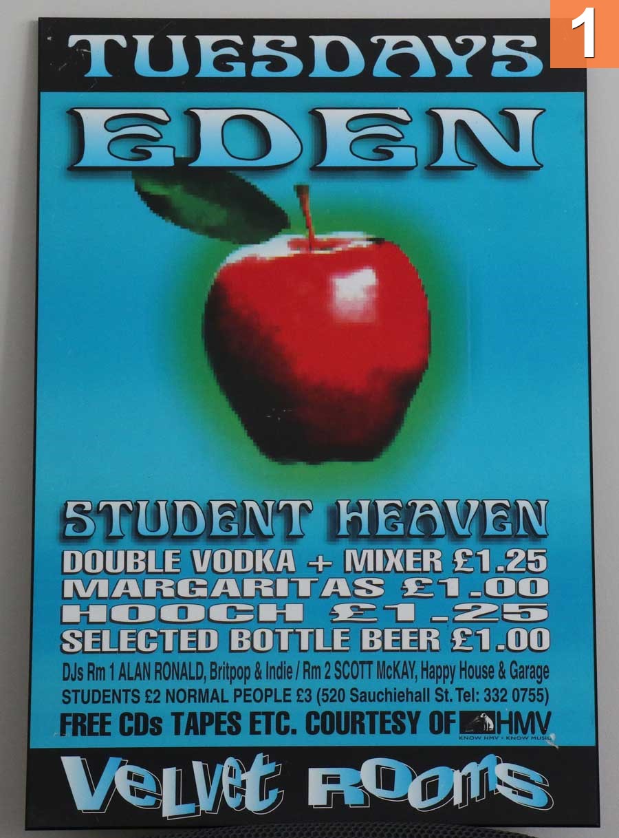
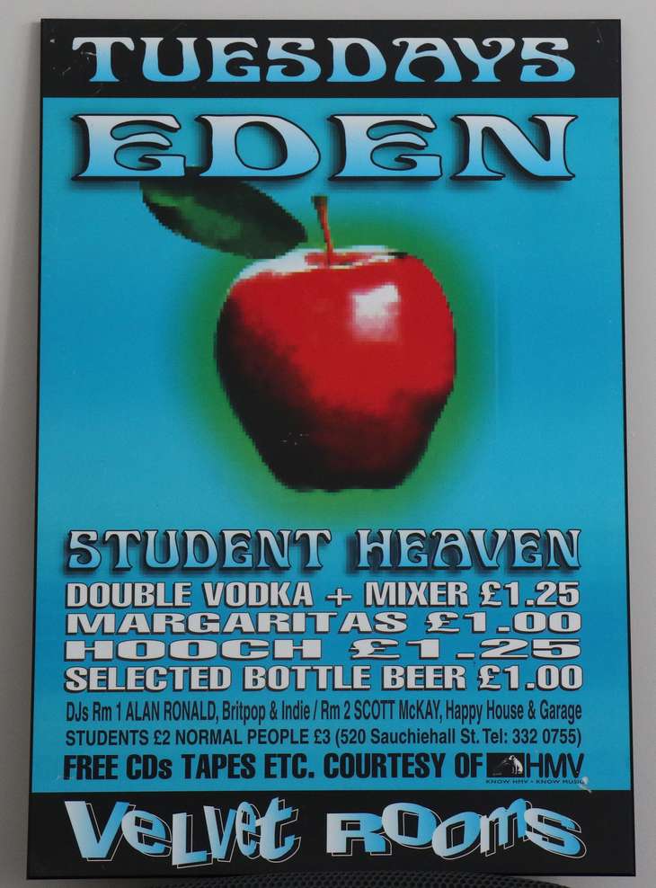
In case anyone is wondering, the reference images are a photo I took of a bar poster that they used to plaster all over town in Glasgow. I held onto a few of them from my time over there and I recently had them mounted. It was neat because every night at each bar had a ‘name’ to it. Tuesday nights at the Velvet Rooms was called “Eden”. Thursdays at Archaos was called “Cop” and so on.
Note that if the pictures all look the same to you, that’s okay. I know that in certain browers, with certain OSes and certain monitors, this is not true and I’m just figuring it out. If you want to provide feedback please do so by contacting me (comments at the bottom or use the + symbol in the top right to contact me)